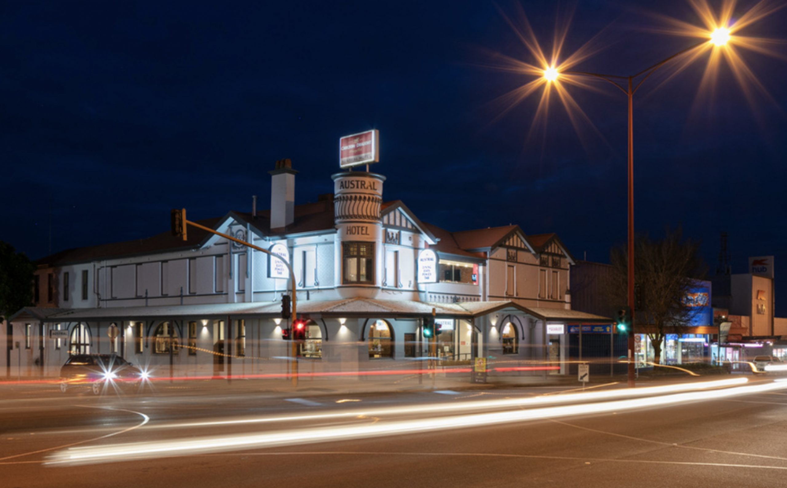
Established in 1873 as the Brewer’s Arms Hotel and renamed the Austral Hotel in 1904, this historic landmark in the heart of Colac has stood as an icon of the city for over a century.
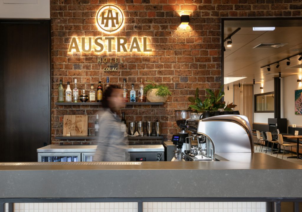
With new ownership and a strong desire to restore the hotel to its former glory, we developed a brandmark that honours both its legacy and its Art Nouveau-inspired architecture. The A.H. monogram draws from the distinctive flared lettering found on the building’s original façade.
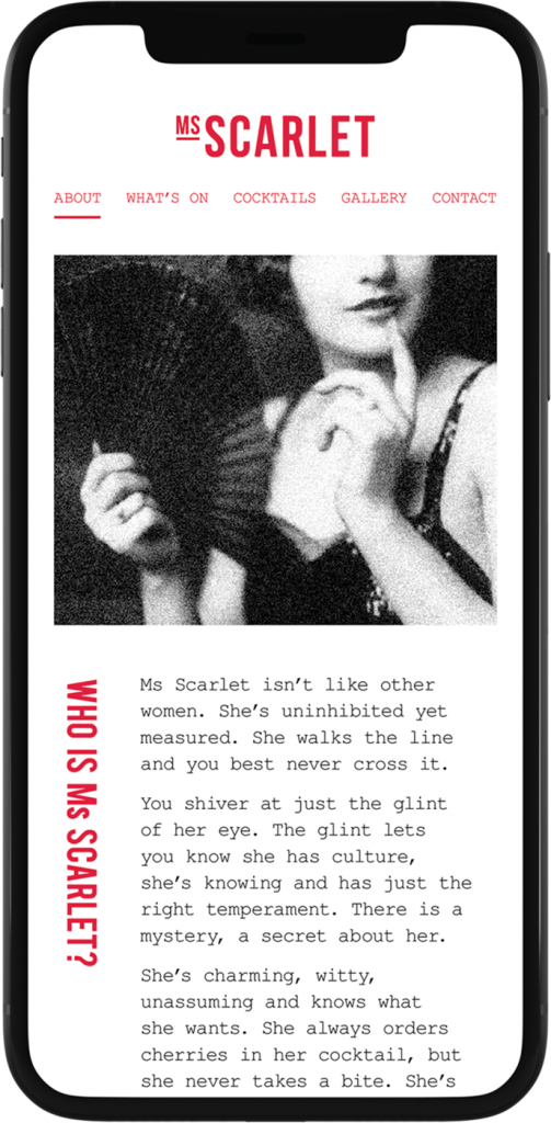
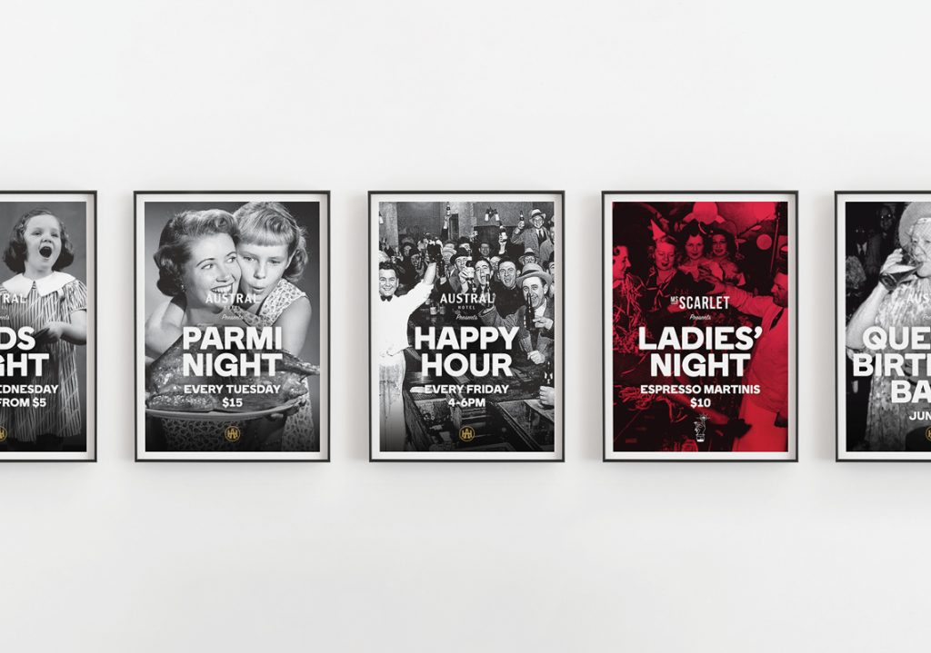
As part of the broader revitalisation, we also reimagined the upstairs nightclub formerly known as ‘Hush.’ Renamed Ms Scarlet—after the Scarlet Blaze wattle, Victoria’s Centenary of Federation floral emblem found in the nearby Colac Botanical Gardens—the new identity signals a fresh start. The logo references both the era in which the Austral was established, with subtle nods to early 1900s women’s fashion, and the venue’s past through a refined ‘hush’ finger icon.